From daily prices to long-term trends
In 2016 the NSW Government introduced mandatory price reporting for fuel stations across the state, and made the data public through FuelCheck NSW. It is a genuinely useful tool. On any given day, a driver can find the cheapest station nearby. But it stops there. There is no way to see how prices move over time, so it cannot help anyone plan ahead.
My goal was to build on the same publicly available data from Data NSW and answer a different set of questions. What is the average fuel price by city or region? How much do prices vary between stations in the same area? What are the historical trends? Which stations and brands are consistently cheapest or most expensive? Do prices move by day of the week, or by season?
The goal: turn a same-day price lookup tool into a proper trend analysis dashboard, built on a pipeline I owned end to end, from raw API and file ingestion through to a two-page Power BI report.
This project has since been rebuilt. The local PostgreSQL pipeline described below now runs as a fully automated, cloud-hosted ELT system on GitHub Actions and Neon. See NSW Fuel Price - Cloud Data Pipeline for the rebuild.
Development approach and environments
For this project I used PostgreSQL for database storage, Python for API connections and data processing, and Power BI for visualisation.
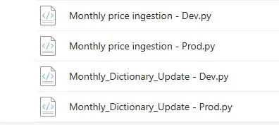
To manage risk, I split the build across two separate environments: Development and Production. Every feature was built and tested in Development first, and only moved to Production once it was working as expected. Coming from ETL tools like Talend and pipelines in Microsoft Fabric, I also mapped out each transformation visually in PowerPoint before building it, the same way you would lay out stages in an ETL workflow.

This split ran through every layer of the build. Scripts were duplicated into Dev and Prod versions while a feature was being tested, and the database itself had separate Dev and Prod schemas so nothing untested could touch live data.
Initial setup: the fuel station dictionary
Before any prices could be loaded, I needed a reliable reference table of every fuel station in the state. This started with the ingestion of fuel station information from the API, including station name, address, brand, and coordinates.
- Ingestion — JSON responses from the API were parsed and normalised into a structured Pandas DataFrame.
- Transformation — regular expressions extracted street, town, and postcode from the raw
address field, a
last_updatecolumn was added, and the remaining columns were renamed for consistency. - Data quality check — the dataset was split in two. Rows where street, town, and postcode were extracted successfully went one way. Rows where the address format was too inconsistent to parse went into a separate table for manual review.
- Storage — connected to PostgreSQL via SQLAlchemy, and inserted clean rows into
temp_fuel_station_dict, with the rest going intotemp_dict_to_clean.
The original scope also included enriching this table with a secondary postcode dataset. I dropped that later in the build, it added complexity without giving the level of insight I expected.
Monthly data ingestion: the fuel price fact table
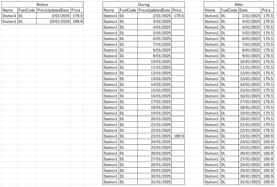
The NSW Government publishes fuel price data between the 15th and 20th of each month, as an Excel or CSV file. These files are saved locally and processed through a dedicated dataflow. This step needed the most data engineering, because prices are only reported when they change. In hindsight, this is a classic change data capture (CDC) pattern, where the source only gives you a new record when a value changes rather than a full daily snapshot. To analyse trends properly, I needed a row for every station, every fuel type, every single day, not just the days a price changed.
Importing and matching
- A tkinter file picker selects the input file, and the script detects whether it is Excel or CSV.
- An active station query pulls the current
fuel_station_dictfrom PostgreSQL. - The input data is left-joined to the station dictionary on service station name and address to attach a
stationid. - Columns are selected and renamed to
stationid,fuelcode,date, andprice, and the date column is normalised to a proper datetime.
Building a complete daily series
The goal here is one row per fuel station, per fuel type, per day.
- Extracted every unique station and fuel code pair present in the file.
- Queried historical prices for the last day of the previous month, to give the series a starting point.
- Unioned current and previous station-fuel combinations, then generated a full date range across the month.
- Cross-joined the station-fuel combinations with that date range, giving a complete daily grid before any prices are attached.
Averaging, filling, and finalising
A small number of stations update their price more than once a day, so the average price per day is calculated first. From there, the previous month's prices are joined to the expanded grid, followed by the average prices for each station, fuel type, and day combination.
- Forward fill — missing prices within each station-fuel group are filled forward from the last known price.
- Cleaning — rows still missing a price after the forward fill are removed, and the data is filtered down to the current month only.
- Unique identifier — a
record_idis generated for each row using an MD5 hash.
A stored procedure runs once a month to remove rows where a station has not reported a price in the last 90 days, so an old price cannot silently carry forward forever.
Before anything is written to the database, a final validation checks that every station in the fact table can be matched to a record in the dictionary. If any cannot, they are saved to a CSV for manual investigation and the script stops there. If everything matches, the data is inserted into PostgreSQL through SQLAlchemy.
Monthly data check: keeping the station dictionary current
The DataNSW API returns a real-time list of active fuel stations, and that list is constantly changing. The monthly data check compares that live list against the database to catch what has changed since last time.
- Join the tables — a full join between the API data and the database table, so nothing on either side gets missed.
- Compare — the join surfaces new stations present in the API but not the database, inactive stations present in the database but no longer in the API, and updated stations where the name or address has changed.
- Stored procedure — truncates the staging tables for deleted, updated, and new records ahead of the next load.
- Insert — the changes are loaded into the database, then manually validated before being merged into the main dictionary table.
Data visualisation and DAX
Two features in the dashboard took a disproportionate amount of time to get right: a time period filter for previous week, month, six months, or year, and a distance filter for finding stations within a set radius of a chosen town.
Time period filter
This was built with inspiration from an SQLBI article on the topic, using a new Previous Date
table, the functions DATESINPERIOD(), REMOVEFILTERS(), KEEPFILTERS(),
and USERELATIONSHIP(), and calculation groups built in Tabular Editor with
SELECTEDMEASURE().
VAR NumOfMonths = -12
VAR ReferenceDate = MAX ( 'DateTable'[Date] )
VAR PreviousDates =
    DATESINPERIOD (
        'Previous Dates'[Date],
        ReferenceDate,
        NumOfMonths,
        MONTH
    )
VAR Result =
    CALCULATE (
        Selectedmeasure(),
        REMOVEFILTERS ( 'DateTable' ),
        KEEPFILTERS ( PreviousDates ),
        USERELATIONSHIP ( 'Previous Dates'[Date], 'DateTable'[Date] )
    )
RETURN Result
Distance filter
This one took longer. The original concept came from a How to Power BI tutorial, which I then adapted to fit my own data model. It uses a calculated table holding the average latitude and longitude for each town, built from the station dictionary and not connected to any other table in the model. A parameter with a slicer controls the distance in kilometres, and a second slicer selects the town. From there:
-- Filtering measure
Location Filter = IF ( [Distance] <= [Distance Parameter Value], 1, 0 )

-- Filtered version of each measure used on the page, e.g. the card visual
Average Price_Filtered =
CALCULATE (
    AVERAGE ( 'prod fuel_prices'[price] ),
    FILTER ( 'prod fuel_station_dict', [Location Filter] = 1 )
)
The map visual is then filtered at the visual level, using the location filter measure to only show rows equal to one.
The result
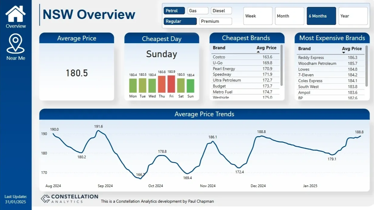
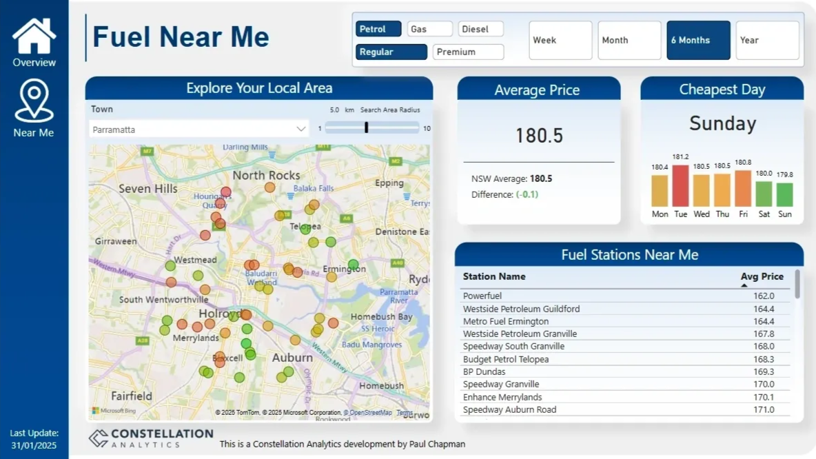
The final dashboard is a two-page report with a selection panel at the top, where users choose their fuel type and analysis period.
The main page gives high-level insight at a state level, letting users track their selected fuel over time and see which fuels are cheapest or most expensive. The second page goes deeper, letting a user pick their town and find the best day of the week to buy, along with the average price for stations in their area. Together, the report is built to support real purchase decisions, not just same-day lookups.
Challenges overcome
Inconsistent data from the source. Early on, the dataset created a new record whenever a station changed address. That behaviour changed partway through, and existing stations began updating their address in place instead. I had to rework the change-detection logic to correctly track stations through both patterns.
Complex distance filtering. Getting an accurate, radius-based filter working in Power BI took extensive testing. Balancing precise calculations against report performance was the main tension to manage.
Personal reflection
This has been my most comprehensive and rewarding project to date. It pulled together data engineering, API integration, SQL, and Power BI into one end-to-end solution. I rarely get to work across all those areas on a single project, so having access to this dataset let me apply and sharpen the full set of skills at once.
Looking ahead, I want to extend the dashboard with real-time data, optimise it for mobile, and explore forecasting models to predict where fuel prices are heading next.
Questions about this project or the dashboard design? Get in touch.
↑ Back to top