The challenge
This project is a submission for the Maven LEGO Challenge, the first data challenge Maven Analytics ran in 2024. The objective was to build an interactive dashboard or visual that lets users explore the history and evolution of LEGO sets over the past five decades.
The dataset is a single CSV file containing every LEGO set released from 1970 to 2022, with details on each set's theme, piece count, recommended age, retail price, and image. In total: 18,459 records across 14 fields.
The goal:
Build an interactive dashboard or visual for users to explore the history and
evolution of LEGO over past 5 decades
Data exploration and cleaning
Because the dataset is relatively small, I started in Excel. A few pivot tables gave me a quick read of the shape of the data. Which fields were well populated, how the themes were distributed, and where the gaps were.
The most important decision at this stage was which columns I could and couldn't use. Both the retail price and age range fields had a high frequency of null values, with usable data only from 2010 onwards. Rather than carry those fields into the analysis and risk misleading visuals, I removed them from my scope and set them aside early.
"Retail price" and "age range" are only reliably populated from 2010 onwards. Any analysis involving these fields would be limited to that window.
With a clear picture of the usable fields, I moved to Python to prepare the dataset for Power BI. The key steps were dropping unused columns, removing non-LEGO product categories that were polluting the theme analysis, dropping rows with missing piece count or theme group values, and generating a decade column for time-based grouping.
# Drop columns that are not needed
df = df.drop(columns=["subtheme", "bricksetURL", "thumbnailURL", "imageURL"])

# Look at the number of unique categories
unique_category = df['category'].unique()
print(unique_category)

# Remove categories that are not real LEGO sets
exclude = ['Book', 'Other', 'Gear', 'Random']
df = df[df['category'].isin(exclude) == False]

# Drop rows with missing values in key fields
df = df.dropna(subset=['pieces'])
df = df.dropna(subset=['themeGroup'])

# Create a decade column for time-based grouping
df['decade'] = (df['year'] / 10).astype(int) * 10
Data analysis
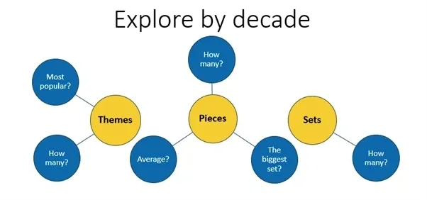
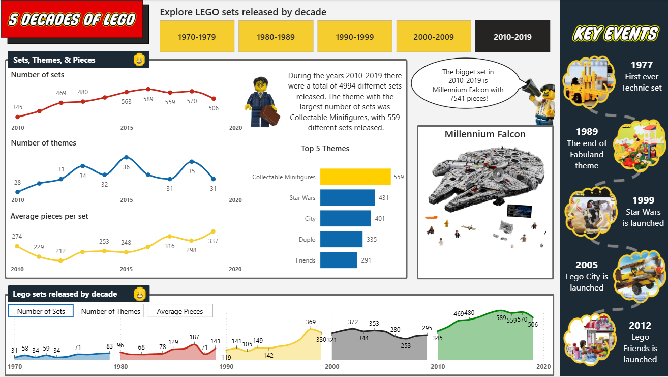
With a clean dataset, I spent time putting pen to paper and brainstorming what the data could support before opening Power BI. Themes, piece counts, and set volume over time were the three main angles I chose to explore.
In Power BI, I created one tab per attribute and started to draft measures and charts from there.
To
extract the top set within the selected decade, I use the following DAX. I found several large education
resources which skewed my results. Therefore, I excluded these sets from the Top Set calculation to make the
insights more relevant to Lego enthusiasts.
Top_Set =
CALCULATE (
    SELECTEDVALUE ( lego_sets_Cleaned[name] ),
    TOPN (
        1,
        FILTER (
            ALLSELECTED ( lego_sets_Cleaned ),
            lego_sets_Cleaned[themeGroup] <> "Educational"
                && NOT CONTAINSSTRING ( lego_sets_Cleaned[name], "Educat" )
        ),
        [Sum_Pieces], DESC
    )
)
Dashboard design and build
Before building anything in Power BI, I drafted the layout in PowerPoint. Being able to quickly move elements around without worrying about measure logic made it much easier to settle on a structure. Once the layout was decided, I moved to Power BI to build the measures and finalise the design.
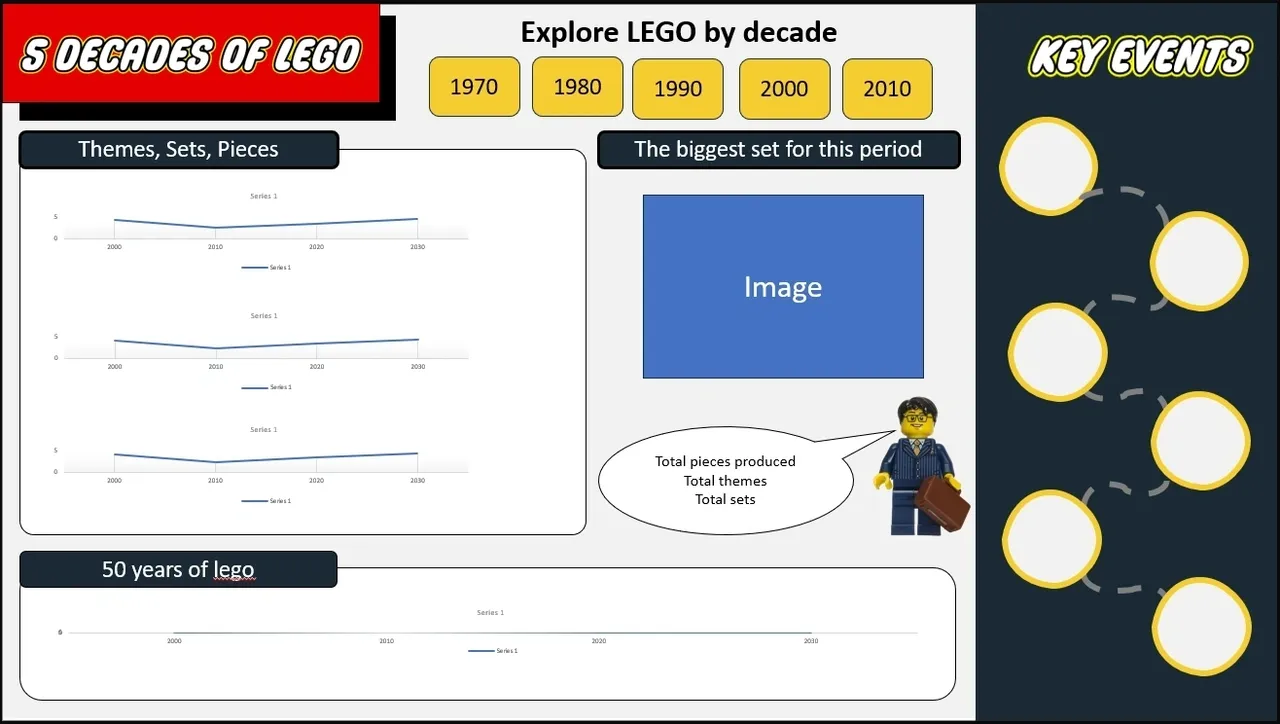
The final dashboard uses a LEGO-inspired colour palette — primary red, yellow, and blue — to make the visual theme immediately recognisable without becoming distracting.
Dynamic text commentary
To add context that updates alongside the user's selections, I used DAX to generate dynamic text
commentary. UNICHAR(10) handles line breaks within the text output, keeping the commentary
readable across different filter states.
text_biggestset =
"The bigget set in " & [Decade] & " is " & UNICHAR ( 10 ) & [Top_Set] & " with "
    & UNICHAR ( 10 ) & [Maxpeice_excl_Education] & " pieces!"
Bookmark-based measure switching
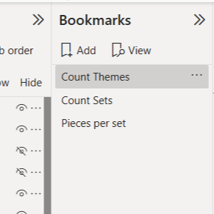
To let users switch between different measures on the same chart, I built three separate visuals and used Power BI bookmarks to dynamically show or hide them based on button selection.
Since creating this in 2024, I’ve learned more efficient approaches, such as using field parameters to switch measures within a single visual. However, at the time, I was unfamiliar with this technique, and the bookmark approach provided a clean and effective solution without requiring additional complexity.
Conditional formatting for top themes
The leading theme in each decade is highlighted automatically using a DAX measure driving conditional formatting. This means the highlighting stays correct when filters change, with no manual annotation required.
colourformatting =
VAR maxcount = [Maximumthemecount]
RETURN
    SWITCH ( TRUE (),
    [Count_Sets] = maxcount, "#ffcf00", "#0d69ab" )
Dynamic images using URL fields
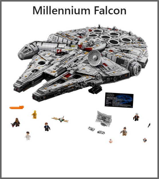
The dataset includes web-based image URLs for each set. Power BI supports displaying these URLs directly in a table visual, which made it possible to show the top set per decade alongside an actual image of the product. This was a new feature for me on this project. My initial plan was to use bookmarks for this too, but the URL-based table approach turned out to be considerably simpler and more scalable.
The final outcome
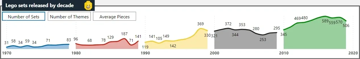
The final dashboard was an interactive dashboard with Lego inspired colours and theme that allows users to explore the history of Lego over the past five decades. The dashboard includes dynamic text commentary, measure switching through bookmarks, conditional formatting to highlight top themes, and dynamic images to bring the data to life.
Reflections
This was a clean project to work through. There were no points where I became genuinely stuck, but there were several moments where I knew a particular visual or measure was achievable and had to work out the right method.
Changing the measure within a chart
The bookmark trick for switching measures is worth keeping in the toolkit. It is not the most elegant solution architecturally, but it is reliable and easy to understand when maintaining the report later.
Changing the image with a slicer
The dynamic image feature was a completely new feature for me, and I absolutely love it. This would have to be the standout discovery on this project and it opened up a category of visual storytelling I had not used before and will certainly use again.
Here is the youtube tutorial I used DYNAMIC Images in Power BI DYNAMIC Images in Power BI
Finally
Doing the exploratory work in Excel before touching Power BI saved real time. The decision to drop retail price and age range from the main analysis was made in a few minutes with a pivot table. Making that call after visuals were already built around those fields would have been significantly more painful to unwind.
Questions about this project or the dashboard design? Get in touch.
↑ Back to top